Visuals
General Design
Every design decision should make it easier for the viewer to understand, interpret, and act on the information being shown.
A dashboard is successful when its form supports its function—when design reinforces meaning instead of competing with it.
Good design is almost invisible: it feels natural, logical, and effortless to use. You achieve functional design when users notice the content rather than the layout.
Following these principles ensures that all design discussions are grounded in usability and comprehension, not personal taste.
| Principle | Explanation | |
|---|---|---|
| 1 | Function before form | Every visual, color, or label must earn its place. If removing an element doesn’t reduce understanding, remove it. |
| 2 | Clarity over creativity | Design should reveal the message, not showcase artistic skill. Use familiar chart types and proven visual patterns that require no explanation. |
| 3 | Purposeful restraint | Simplicity is an active design choice. Limiting color, shapes, and motion helps users focus on what matters most. |
| 4 | Consistency creates comfort | A uniform structure across dashboards builds user confidence and speeds interpretation. |
| 5 | Information hierarchy guides attention | Arrange content from overview to detail so the eye naturally moves through the story you want to tell. |
Why It Matters
Dashboards are decision-support tools, not aesthetic displays. When visual polish becomes the priority, comprehension slows down and trust erodes. A glossy but confusing dashboard can mislead decision-makers just as easily as incorrect data.
In practice, clarity and structure determine whether data becomes knowledge. An effective dashboard organizes information so users immediately recognize patterns, outliers, and priorities without decoding visual noise.
Simplicity and restraint don't mean "plain"—they mean purposeful. A clean, well-structured layout communicates reliability and professionalism, while an overly decorated one signals uncertainty or distraction.
The less a user has to think about how to read a dashboard, the more mental energy remains for interpreting what the dashboard is telling them.
Do’s
-
Design for legibility: Choose clear, professional fonts and maintain consistent text sizes. Align visuals along a clean grid to avoid cluttered impressions.
-
Use color as a signal, not a theme: Reserve bright or saturated colors for meaning — for instance, red and green to indicate below or above target. Neutral backgrounds reduce cognitive load.
-
Limit focal points: One to three key insights per page is sufficient. Each additional highlight competes for attention and weakens impact.
-
Prefer standard, interpretable chart types: Column, bar, line, and card visuals are fast to read. When comparing relative proportions, a treemap communicates more accurately than a multi-slice pie chart.
-
Apply the ten-second clarity test: Hand the dashboard to someone unfamiliar with the data. If they cannot articulate the main message within ten seconds, the design needs refinement.
-
Group related information logically: KPIs, trends, and breakdowns should appear together. Consistent positioning across reports helps users form habits.
-
Allow whitespace to breathe: Margins and spacing are not wasted space — they create focus and guide the eye.
Don'ts
-
Avoid decorative effects: Gradients, 3-D shadows, and glowing borders rarely improve comprehension and often distract.
-
Don't embed branding into analytical space: Logos, taglines, or marketing backgrounds belong on cover pages, not near charts.
-
Don't fill empty areas for the sake of symmetry: Balanced composition matters less than clear communication; whitespace is intentional design.
-
Don't overload a view: Mixing many chart types or cramming all KPIs on one screen creates noise instead of insight.
-
Don't emphasize aesthetics over accuracy: Never sacrifice readability or interpretability to make something "look interesting."
-
Don't let color or motion dominate: Animated visuals or flashing highlights fatigue users and draw attention away from what matters.
Dashboards
Duck Dashboard (avoid!)
A common mistake is building dashboards that try to do everything but excel at nothing. Think of it like a duck that can swim and fly, but neither particularly well. This happens when we attempt to serve all user groups and answer every possible question in a single interface.
The problem: Different users have fundamentally different needs. Managers need strategic overviews with clear KPIs for tracking performance—they are the eagles. Analysts need exploratory tools to discover correlations and root causes—they want to deep-dive, like a penguin. Combining both in a single dashboard creates an overloaded interface that serves no one effectively.
The solution: Create specialized dashboards:
- Guided Dashboards for management (eagles): Structured reports delivering clear answers with minimal clicks. Highly visual, KPI-driven, and self-explanatory.
- Analytics Dashboards for analysts (penguins): Interactive, exploratory tools enabling deep data investigation. Often in tabular/matrix form, using field parameters and drill-through.
Eagle Dashboard (Manager)
A manager needs to see key figures (often KPIs) at a single glance.
Eagle Best Practices
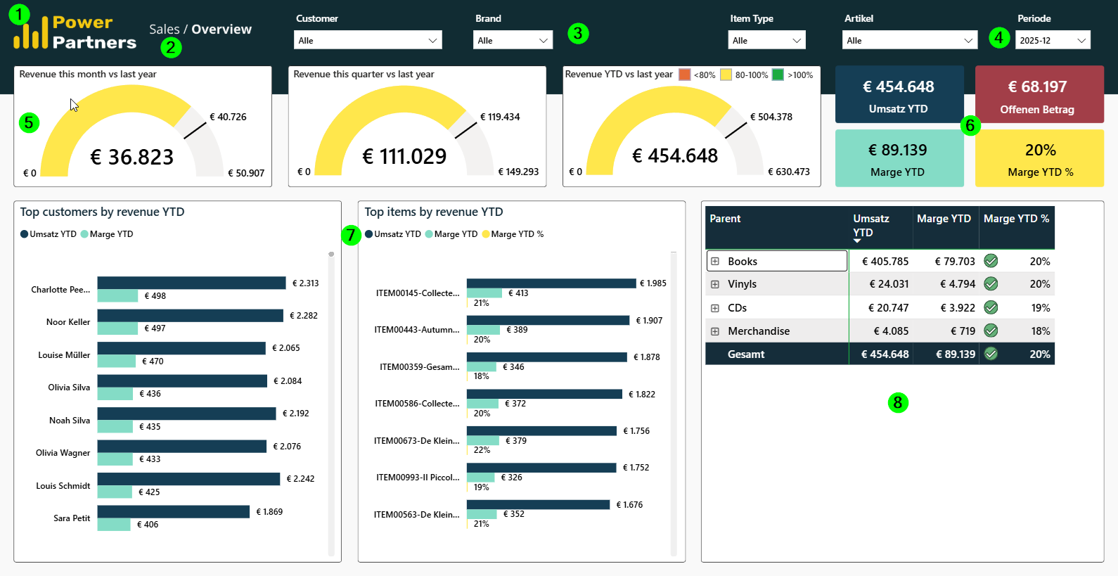
-
Client logo on top left
-
Dashboard name
-
Filter header (visually separated from the main part)
-
Date filter always top right
-
KPI header
-
Use gauges for progress toward a goal; use cards for commonly referenced numbers or KPIs
-
At most three detail sections
-
Use top lists for different dimensions; if using tables, limit to 3 columns and 2 levels maximum
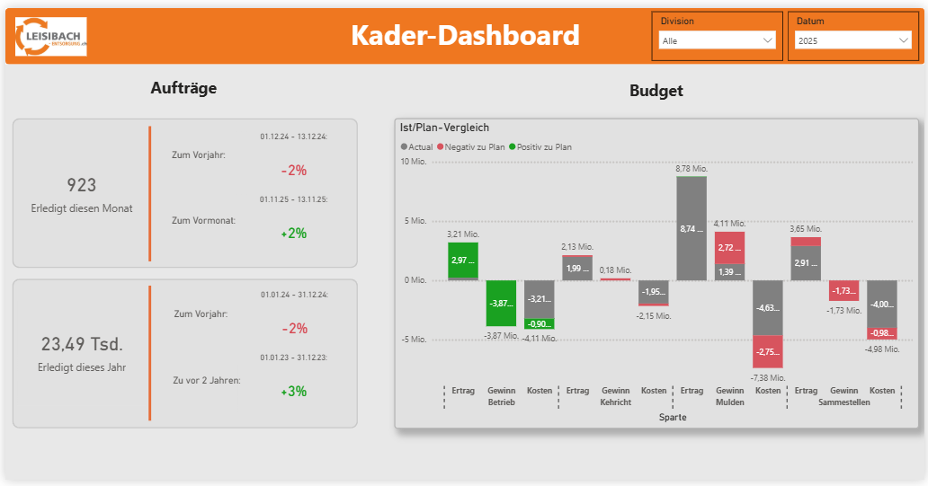
Examples
Penguin Dashboard (Analyst)
This dashboard is for the data power users such as analysts, accountants, controllers, operations managers, etc. It is not for most general managers (though some general managers are penguins).
These dashboards are often tabular and contain drills, field parameters, and advanced features.
Penguin Best Practices
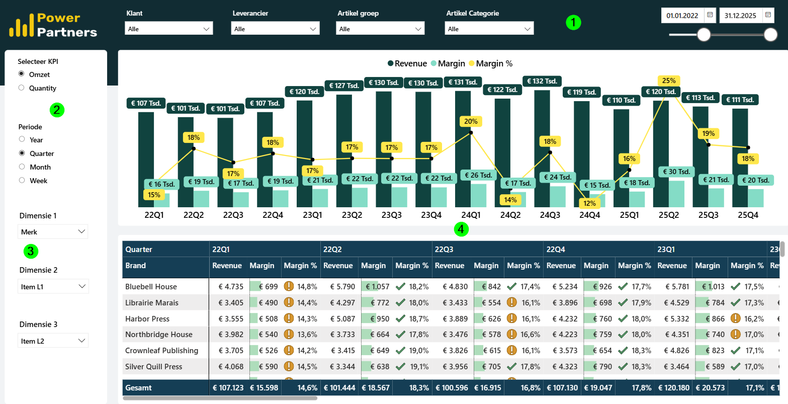
-
Same principle as for eagle: header with different background, filters, date top right
-
Additional switchboard on the left
-
Allow selecting variable, period, and hierarchy
-
Master-detail layout (sometimes master is omitted)
Examples
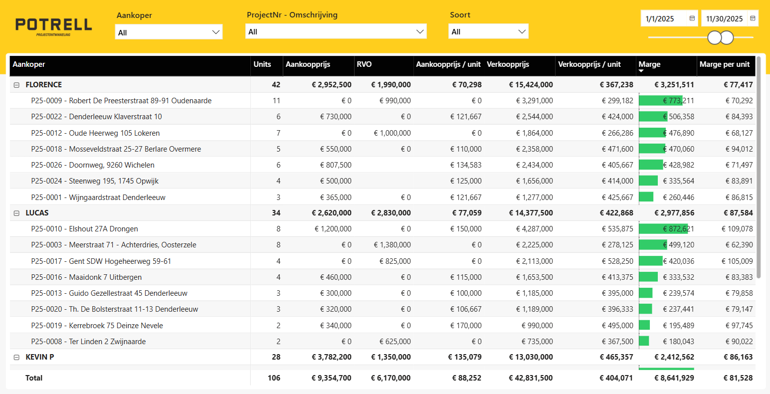
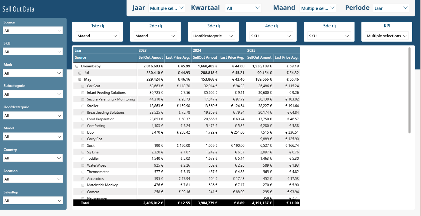
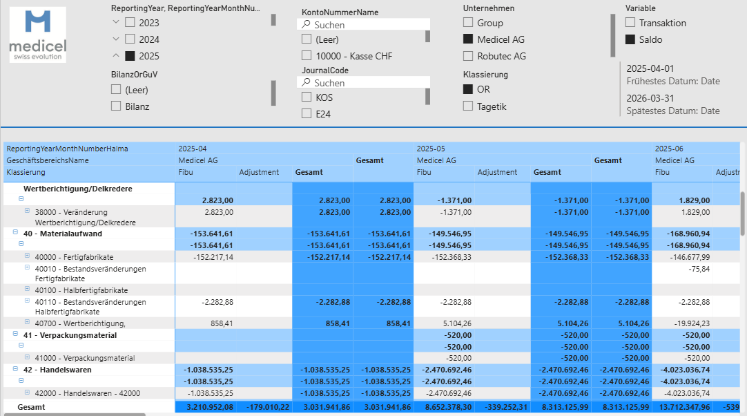
NOTE: the medicel example does NOT respect all the best practices. Can you spot the deviations?
Visuals
Principles
-
Do not cut the axis
-
Use data labels
-
Use colors with semantic meaning where possible (e.g., red for "bad", green for "good")
Chart Chooser
---
config:
layout: dagre
---
flowchart LR
subgraph COMPOSITION["QUOTA (Percentage of Whole)"]
PieChart["Pie Chart<br><small>3-4 category proportions</small>"]
Treemap["Treemap<br><small>Hierarchical proportions</small>"]
end
subgraph RELATION["RELATION"]
BubbleChart["Bubble Chart<br><small>2-3 variable correlation</small>"]
end
subgraph COMPARISON["COMPARISON"]
BarChart["Bar Chart<br><small>Categorical comparisons</small>"]
ColumnChart["Column Chart<br><small>Time-based trends</small>"]
Waterfall["Waterfall<br><small>Start to end changes</small>"]
end
subgraph EVOLUTION["EVOLUTION"]
n5["Line Chart<br><small>Time series & trends</small>"]
n6["Column Chart<br>Time based trends"]
n7["Waterfall<br><small>Start to end changes</small>"]
end
subgraph PENGUIN["PENGUIN DASHBOARD (Analyst)"]
n2["Table<br><small>Transaction details</small>"]
n3["Matrix<br><small>Hierarchical analysis</small>"]
end
subgraph EAGLE["EAGLE DASHBOARD (Manager)"]
Gauge["Gauge<br><small>KPI vs Target</small>"]
Table["Cards<br>KPIs"]
end
style PieChart fill:#FFFFFF
style Treemap fill:#FFFFFF
style BubbleChart fill:#FFFFFF
style BarChart fill:#FFFFFF
style ColumnChart fill:#FFFFFF
style Waterfall fill:#FFFFFF
style n5 fill:#FFFFFF
style n6 fill:#FFFFFF
style n7 fill:#FFFFFF
style n2 fill:#FFFFFF
style n3 fill:#FFFFFF
style Gauge fill:#FFFFFF
style Table fill:#FFFFFF
style COMPARISON fill:#ff6b9d,stroke:#333,stroke-width:2px,color:#000
style COMPOSITION fill:#4a9eff,stroke:#333,stroke-width:2px,color:#000
style RELATION fill:#ff9933,stroke:#333,stroke-width:2px,color:#000
style EAGLE fill:#9966ff,stroke:#333,stroke-width:2px,color:#000
style EVOLUTION fill:#757575,stroke:#333,stroke-width:2px,color:#000
style PENGUIN fill:#00C853,stroke:#333,stroke-width:2px,color:#000Bar Chart
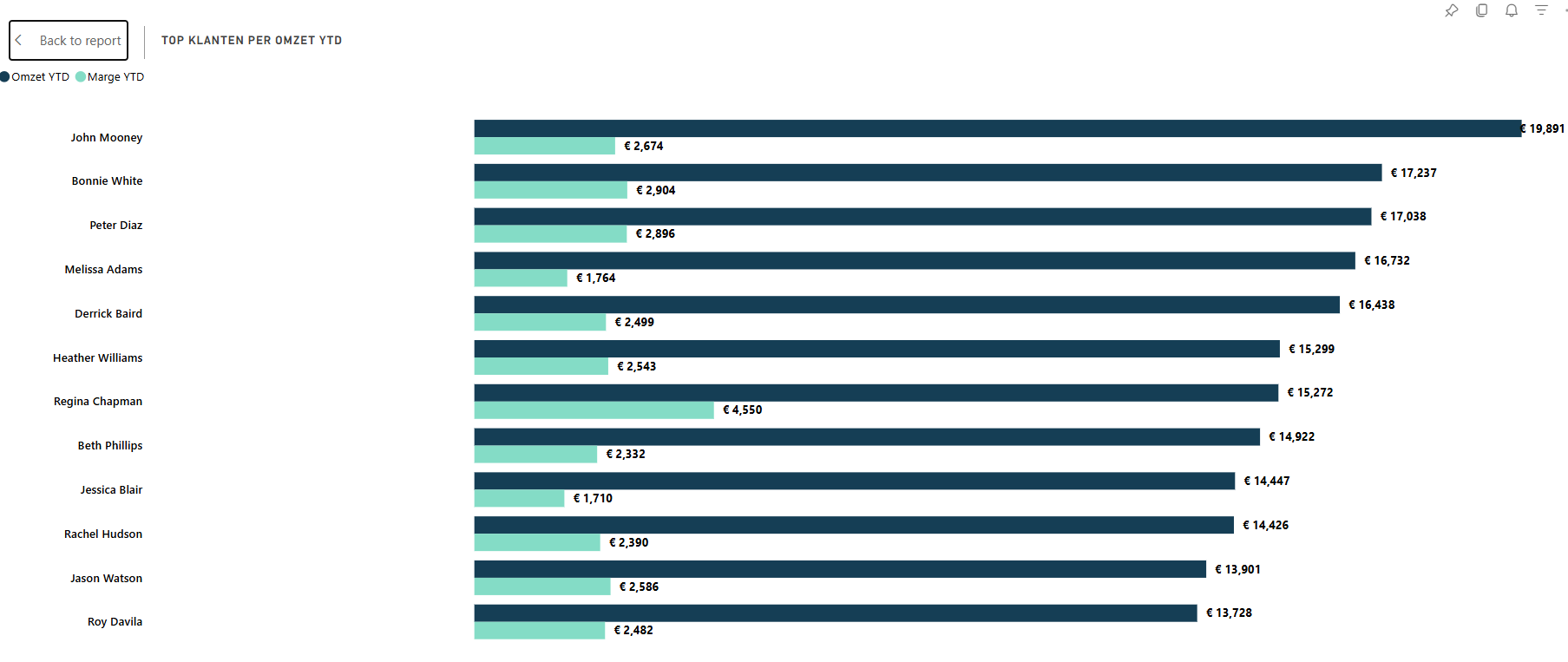
Bar charts are your best friend. If you're unsure how to represent data, start with a bar chart.
Use bar charts when the categories are categorical (i.e., not time-based).
Variations/additional features:
-
Grouped: Adds an additional dimension (e.g., show sales per sales rep for different product categories). Don't use more than 3 groups. Use when:
- You cannot add the two groups together (e.g., Sales and Margin)
- You want to compare both groups individually (stacked bars only allow visual comparison of the bottom group)
-
Stacked: Only use if the variables can be added together (e.g., sales across different product categories)
-
Stacked 100%: Not used very often
-
Multiples: Be aware that you might lose y-axis comparability
Column Chart
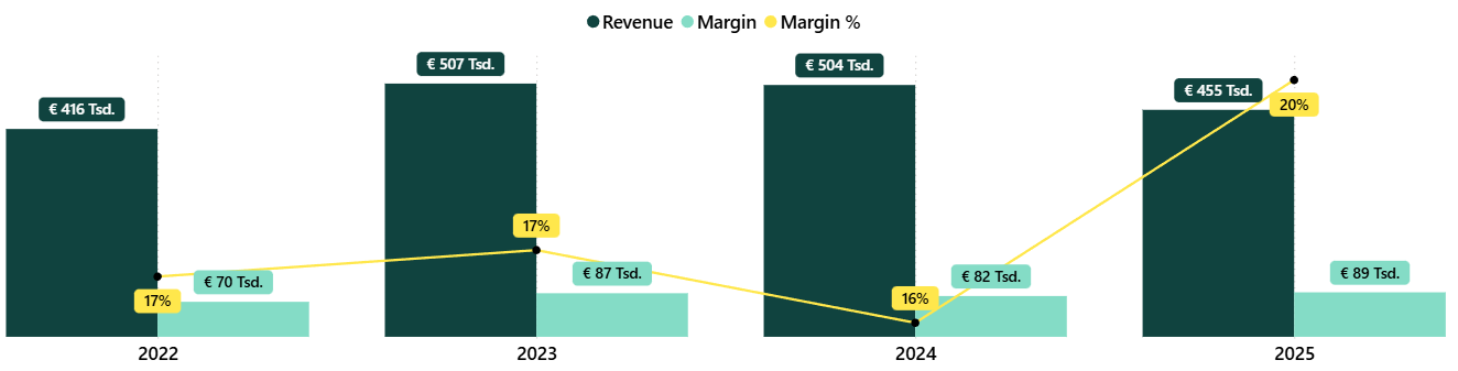
Use column charts to see the evolution of a variable over time.
Variations:
- Combo Chart
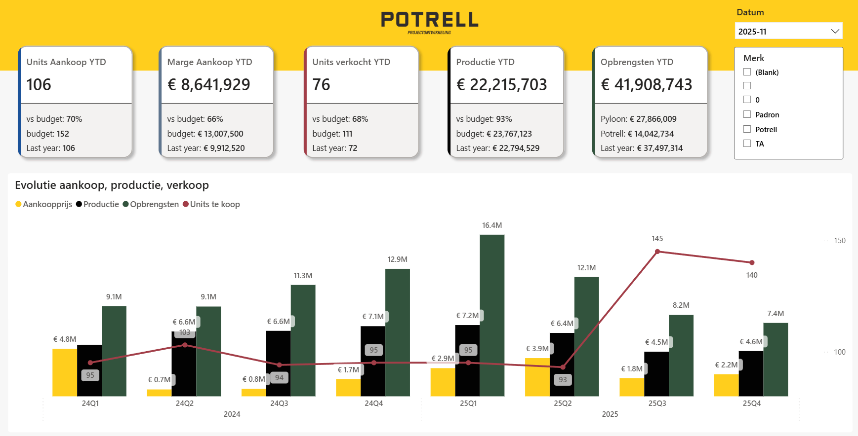
Example of a grouped column combo chart:
Line Chart
IMPORTANT: Do NOT use line charts for categorical data.
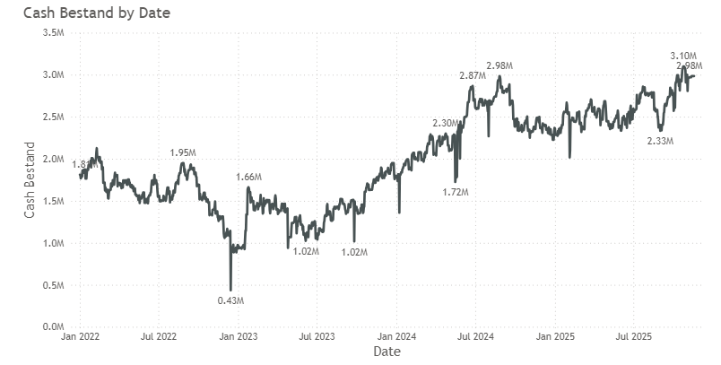
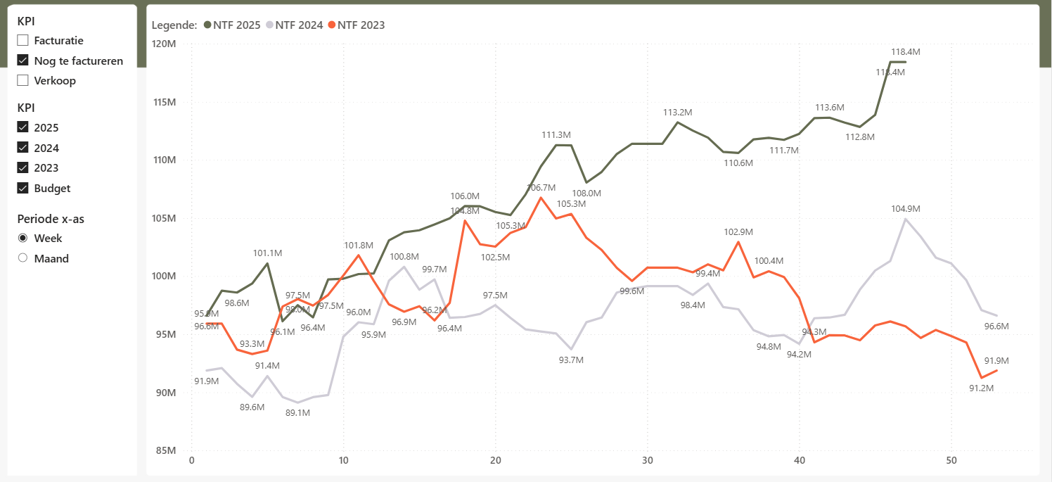
Use line charts for:
-
Visualization of time-dependent progress of a value (e.g., cash balance)
-
X-axis is usually continuous and time-based
-
Ideal for daily or more granular data
-
Comparing several time-dependent variables over the same range or period
Waterfall
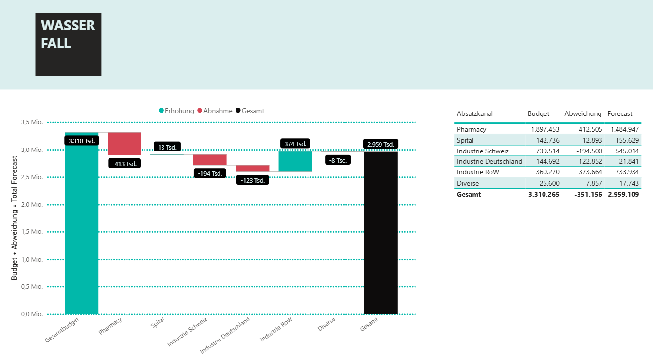
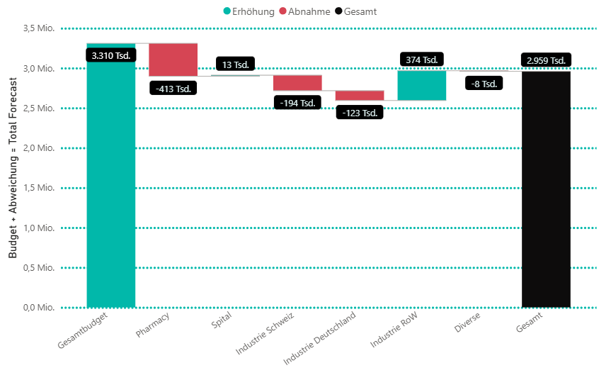
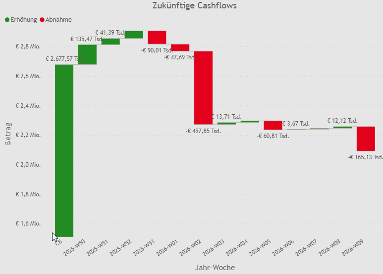
A waterfall chart is useful when you have a start value that changes over time or across categories to reach a certain end value.
Example for categories:
-
Total budget on the left
-
Deviation of sales against budget for different markets
-
Total actuals on the right
Example for time-based waterfall:
-
Current cash balance on the left
-
Expected net cash inflows per week for the next three months
-
Ending balance on the right
Pie Chart
-
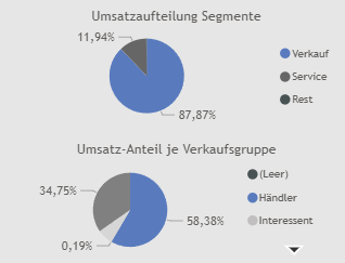
Shows percentage distributions among categories.
-
Use pie or donut charts sparingly—only when 3 to 4 categories are involved to show proportions.
Treemap
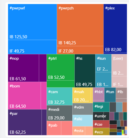
- Treemaps effectively show the different proportions of categories within the whole.
- Larger proportions are usually in the upper part and catch the user's attention.
- Better use of space and more readable compared to pie or donut charts.
- Ideal for drill-down logic.
- Limited readability when too many categories are involved.
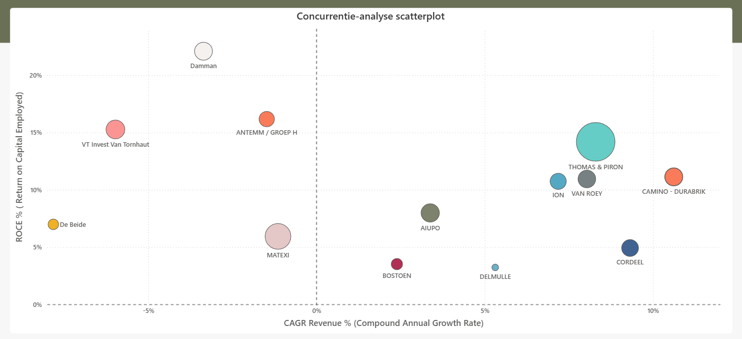
Bubble Chart
-
Generally used to show correlation between 2 or 3 variables.
-
Effective when you have large distributions across categories.
-
Does not work well with more than 15 categories.
-
Preferable for static analysis, less suitable for time-based analysis.
-
Can help provide distribution understanding in presentations.
Gauge
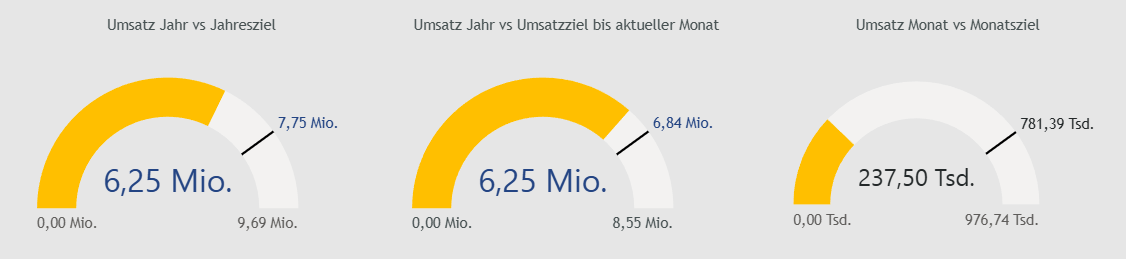
- Compares KPI numbers to current state and a predefined target.
- Useful for tracking whether numbers are on track to reach the target.
- Should use conditional formatting to change color based on current state.
Table
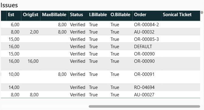
- Used for analytics dashboards (penguins) to display transactions, sales events, etc.
- Provides more granular insight compared to high-level visualizations.
Matrix
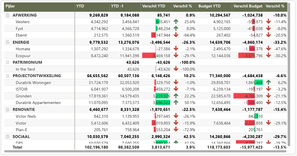
-
Used for analytics dashboards (penguins).
-
Additional features compared to tables:
- Hierarchy
- Group totals (both horizontal and vertical)
- Ability to add symbols and deviations
Interactivity
-
In 90% of cases, you want filter interactions enabled between visuals.
-
Highlighting between visuals is only useful when view categories are present.
Drilling
-
Very powerful, but clients often find it difficult at first and need some time to adopt it.
-
Works especially well with matrices
Pop-Ups
- Avoid custom tooltips they are often too chaotic.