Introduction to Variables
In this section, we define the formulas that we use to calculate numbers. Often, these will be implemented in DAX.
Variables
A variable is a value that is measured multiple times.
Examples of variables are:
- Turnover
- employee satisfaction
- Sales area
- Number of employees
- Page views
Variables are the basic building block of every KPI, and therefore also of every dashboard.
Time series vs. cross-section
We often measure a variable over time: profit in Q1, profit in Q2, profit in Q3, etc.
But sometimes a variable also measures a value for different populations at the same time. Examples:
- Profit in Q4 per department
- Sales per customer since the beginning of the year
- Marketing spend per location
- Sales area per country
In business intelligence, this per is referred to as dimensions: Department, Customer, Location, Country.
It is important to remember that both a screen and a sheet of paper are essentially only two-dimensional. Accordingly, most diagrams are also two-dimensional: bar charts, line charts, etc..
However, one dimension (typically the y-axis) is already used to represent the value of the variable. This leaves one dimension to represent the per, e.g.
- Turnover (variable) per quarter (dimension)
- Turnover (variable) per region (dimension)
- Turnover (variable) per product group
- etc.
For example, it is not easy to show sales per product group, per customer and per region in a single chart.
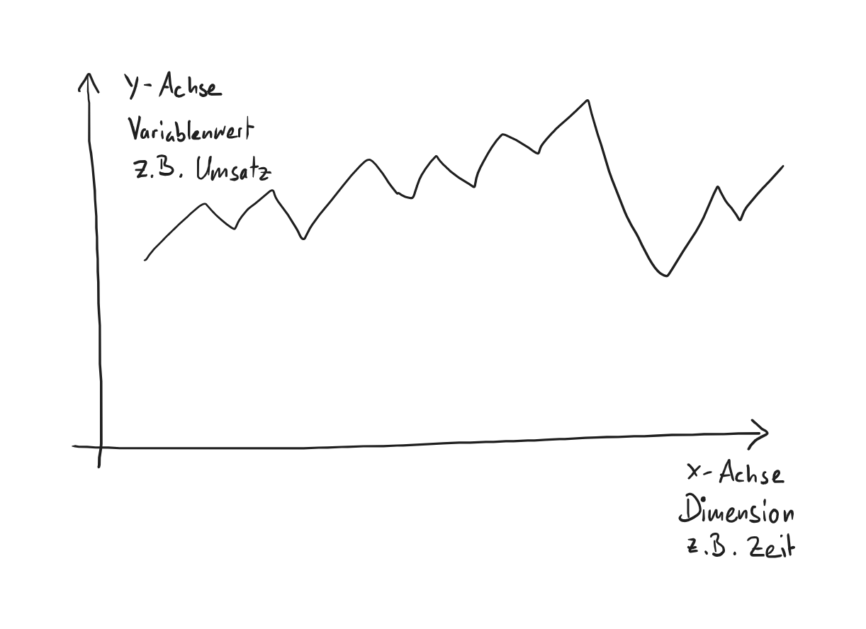
Conversely, it is always easy and natural to show a variable in one dimension. For example in a bar chart:
-
the dimension in the x-axis
-
the value of the variable in the y-axis
For example, the x-axis is the time axis and the y-axis is the turnover. We can then show the turnover over time.
Graphically, this looks like this:
As soon as you want to display more than one dimension of a variable in a diagram, you have to reach into your bag of tricks. For example, you can play with colors or symbols, or use circles of different sizes.
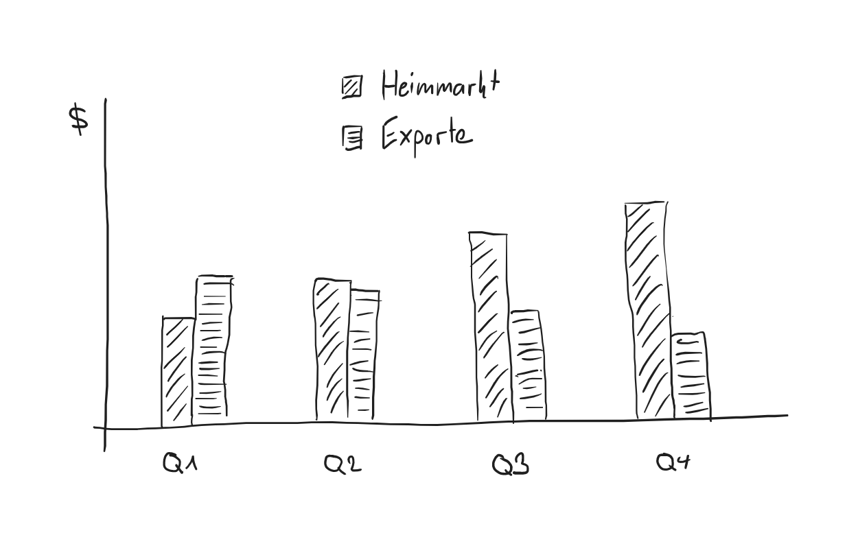
For example, if you want to show the profit per department over time, a multiple bar chart is often used:
Flow Variables vs Stock Variables
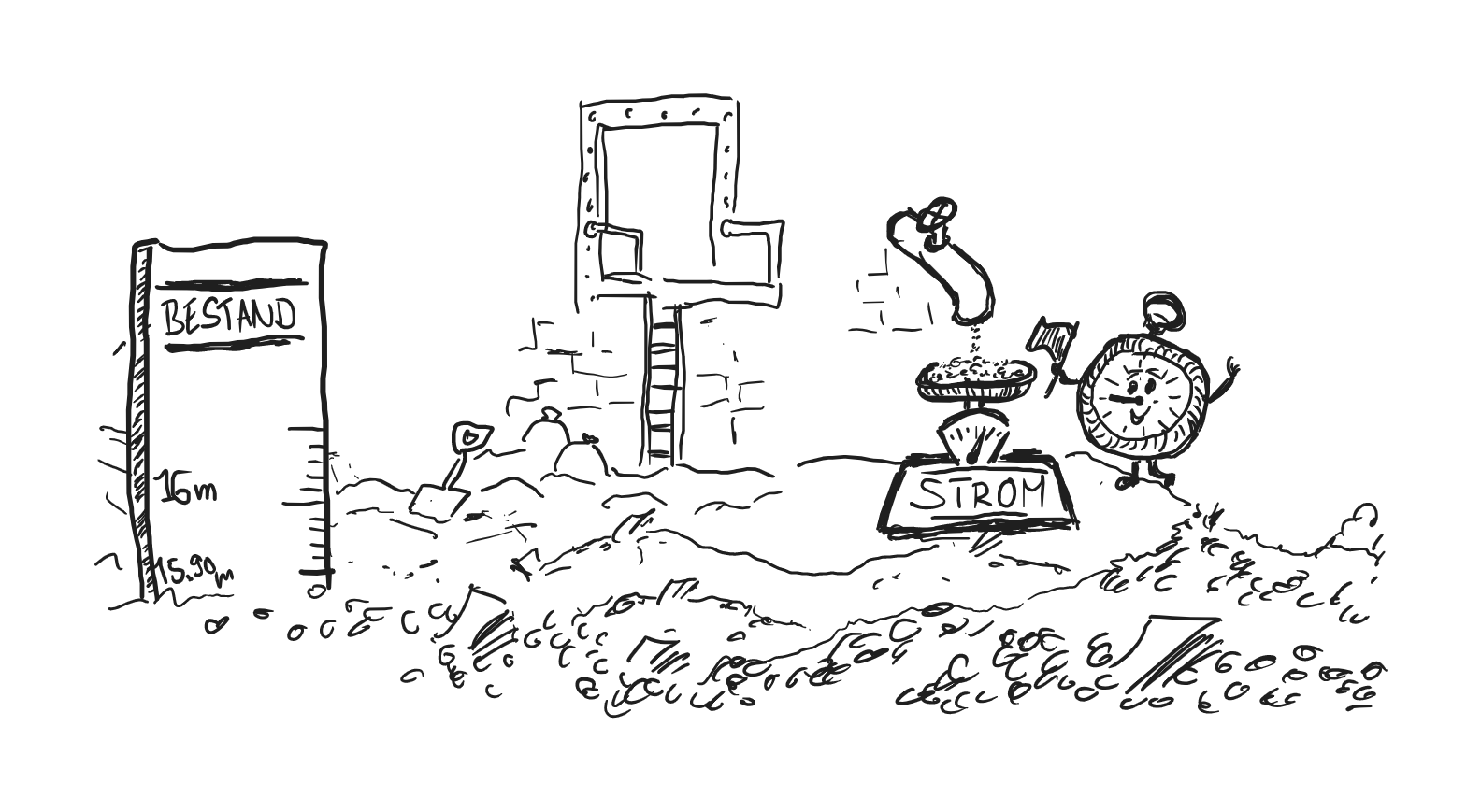
Imagine Scrooge McDuck's money bin filled with gold.
The money in the store is a stock quantity. At any point in time, you can measure how much money Uncle Scrooge currently has.
Now imagine a tube in the wall of the money bin. When the money tap is opened, the coins flow into the money bin in streams. If we measure how many coins flow into the store per minute (or per hour, or per day, or per year), then we measure a flow size.
In BI, both flow figures and stock figures are important.
Examples:
| Stock Variables | Flow Variables |
|---|---|
| Number of employees | Number of new hires, departures, employee turnover |
| Capital | Profit |
| liquidity | income, expenses |
| Office space | Office costs |
| Number of customer accounts | Number of logins per month |
For example, all key figures from the profit and loss statement are flow variables. All key figures from the balance sheet are stock variables.
You need to remember the following:
-
stock variables are always measured at a point in time
-
flow variables are always measured over a period of time
We will see later how we can use operators to convert flows into stocks and vice versa.
Flow Variables and Time Windows: fixed vs. rolling vs. cumulative
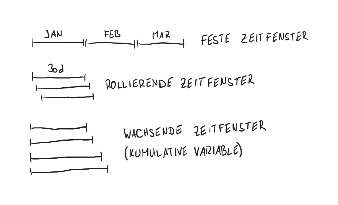
Imagine Scrooge's money bin again, with his money pipe through which the money flows into the vault. If we measure how much money flows into the money bin every month, then we have a flow variable, measured in fixed time windows of one month each. We have the inflow of money per month for January, for February, etc.
If, on the other hand, we measure every day how much money has flowed into the storage facility during the last 30 days, then we speak of a rolling time window. We measure the monthly inflow of money on January 1, January 2, etc.
If instead we measure how much money has flowed in since the beginning of the year, this is a growing time window.
Flows that are measured over a growing time window with a fixed starting point are called cumulative. Typical examples are year-to-date ytd$, month-to-date mtd$ or since-inception si$. It is important to remember that a growing time window also transforms an otherwise stationary variable into a growing variable (see next section).
Fixed time windows are used in particular for displaying variables in diagrams if you want to show the development of the variable over time. The x-axis is then divided into the time windows.
Rolling time windows are always used when we want to display a current variable indicator on a daily basis. The stronger and the longer the variable is cyclical, the longer the time window is selected. For example, if the sales figures only come in weekly, a rolling time window of 7 days is selected. A time window of one day would cause large jumps. A time window of 30 days would display the development with an unnecessary delay.
The disadvantage of cumulative variables is that they contain jumps: In December the 'ytd' turnover is huge, on January 1 it is 0.
On the other hand, cumulated variables do make sense where we set ourselves an annual target. This is very common in the sales area.
Absolute vs. Relative Numbers
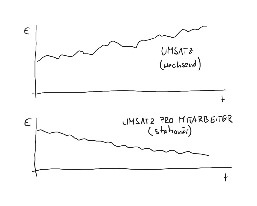
Ideally, you want to monitor the development of key figures over the years. Or you want to compare key figures between different companies. But many variables are not suitable for this because they are not stationary. The turnover of company A with 5 employees cannot be compared with the turnover of company B with 125 employees.
Since turnover typically grows with the size of the company, we call turnover a growing variable.
Most variables are not stationary in their raw form, i.e. as an absolute number, which is why we make them stationary for use as a key figure. This can be achieved, for example, by relating a variable to another variable that is growing at the same rate.
| Absolute number (growing) | Relative number (stationary) |
|---|---|
| Turnover | Turnover per employee |
| Marketing costs | Marketing costs per new customer (\(CAC\)) |
| Profit | Profit margin |
| Growth (monetary value) | Growth rate |
More on this in the section KPIs.
However, there are situations in which it makes sense to use an absolute figure and accept that it is not stationary. This is the case, for example, if you want to impress staff members, customers or investors. Monetary amounts in particular are more concrete than quotas, and sometimes more impressive.
Or, which one sounds more impressive to you:
- He was the first salesperson to sell deals worth more than one million euros per year!
- He was the first salesperson to increase new customer acquisition by 10 % compared to the previous year!
Another example:
- The error caused a loss of 2.5 million.
- The error caused a loss of 0.9 % of our turnover.
But whenever the aim is to inform rather than impress people, you should use relative figures.
Cyclical variables
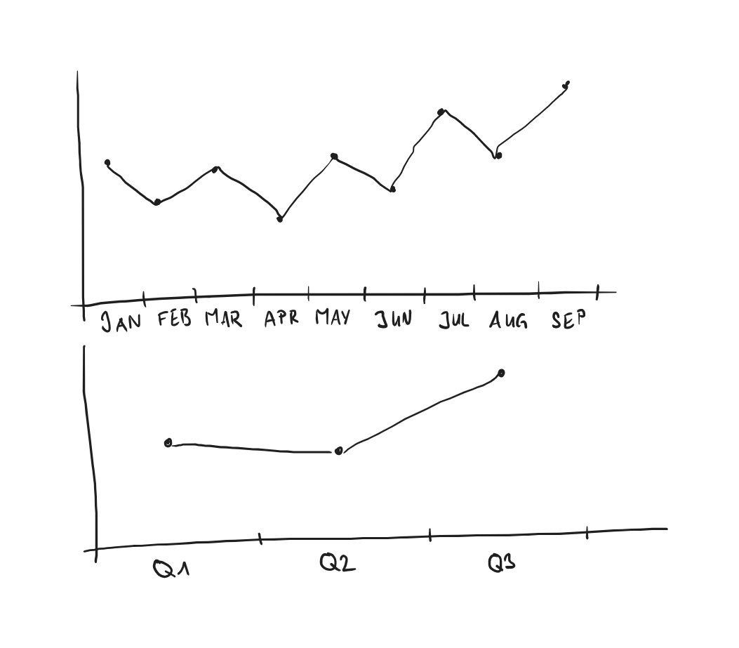
Both increasing and stationary variables can be cyclical. One speaks of cyclical behavior when a variable regularly swings up and down over time. Cycles per week, per month, per quarter or per year are typical. We refer to the length of the cycle as periodicity.
Cyclical behavior tells us a lot about the variable. But sometimes cyclical behavior interferes with analysis or graphing. A company that makes garden ponds will make a larger turnover in the spring than in the fall. So the drop in sales in the fall (compared to the spring) says nothing about the real success of the company.
There are various tricks we can use to smooth out the cyclical behavior of variables, such as
- moving average
- comparison with the previous year
- rolling time windows
- Enlargement of the (fixed) time window
Lagging variables vs. leading variables - leading and lagging indicators
Most variables measure what was, or at least what has been. Financial figures in particular are frowned upon for precisely this reason: in a changed market environment, the profit in 2023 says nothing about the company's ability to generate the same profit in 2024. This is also referred to as late indicators.
However, it would be better to have indicators that predict the future, i.e. early indicators.
On the other hand, it is often forgotten that it is much easier and more precise to measure variables than to predict them. In other words, there is a reason why most indicators draw their wisdom from the past.
But that doesn't mean we shouldn't try to develop forward-looking indicators.
There are few variables that are forward-looking in their raw form. Examples can be found mainly in the financial markets, such as the futures price of crude oil, or the stock market in general. The share price does not relate to the past financial year, but to the confidence of investors that the company will perform solidly in the future.
In the KPI environment, real leading indicators are rare. That is why we try to build a leading indicator from individual lagging variables.
The following example illustrates how we can do this.
Example
Sales Funnel
Suppose we measure the following variables:
- the number and size of upcoming deals in our sales funnel
- the (historical) conversion rate per deal stage
- the average length of our sales cycle
These three variables are measurable, they are lagging. And yet we can predict quite accurately how much capacity we will need in the near future.
Top-Down vs Bottom-Up
Initially, most business owners do "financial controlling by account balance". A single figure indicated the success of the business: the account balance.
Then, once a small business grows, it introduces a proper account system. Different accounts are created for suppliers and customers, and later maybe even one account per customer.
Once a company grows above 50 employees or so, it introduces profit centers, cost accounting, and more. This allows drilling down and analysing the details.
This is the top-down approach. You start at the top, measuring everything in aggregate, and then introduce sub-areas little by little.
In business intelligence, we try to proceed in exactly the opposite way. We always measure variables at the source, at the level of the smallest possible unit: the individual business transaction, if possible. Every transaction is therefore a data point. We decorate this data point with attributes such as order date, customer and product.
For example:
Example
Sales transaction data point
- Amount: 50.99
- Time: 2023-12-23 16:24
- Product: La Vie est Belle
- Product group: Perfume
- Product subcategory: Women's perfume
- Manufacturer: Lancôme
- Item number: 49293493
- Customer: Max Müller
- Customer Gender: male
- Customer number: 193923492
- Payment: cash
- Packaging: Gift
- etc.
Imagine you had thousands of such data points. Imagine further that you had a specialized system that could add up these data points in real time and display them visually.
Welcome to the world of business intelligence.
Suddenly it becomes easy to answer the following questions:
- Which women's perfume was bought most often by men in December
- Are customers who want to wrap their purchases in gift wrap more likely to pay cash?
- Which brand has the biggest growth?
- etc.
We call this approach bottom-up. It is so powerful because it allows us to analyze the data in any dimension. Instead of having to break down an aggregated top-down value into predefined dimensions, we can add up the individual raw data points.
However, there are two problems with the bottom-up approach:
First, we often can no longer analyze such detailed data in a spreadsheet or Excel. There are simply too many data points.
Secondly, there are often variables that are made up of a variable and a fixed component. The fixed component is then a top-down value that we cannot assign to each dimension. More on this in the section on the contribution margin.